The Rubikloud product suite provides major retailers with insights and trends so they can optimize for mass promotions and manage customer lifecycles. When I joined the team I was proud to help improve product design and facilitation processes while also contributing to their design system and UI library.
Process and involvement
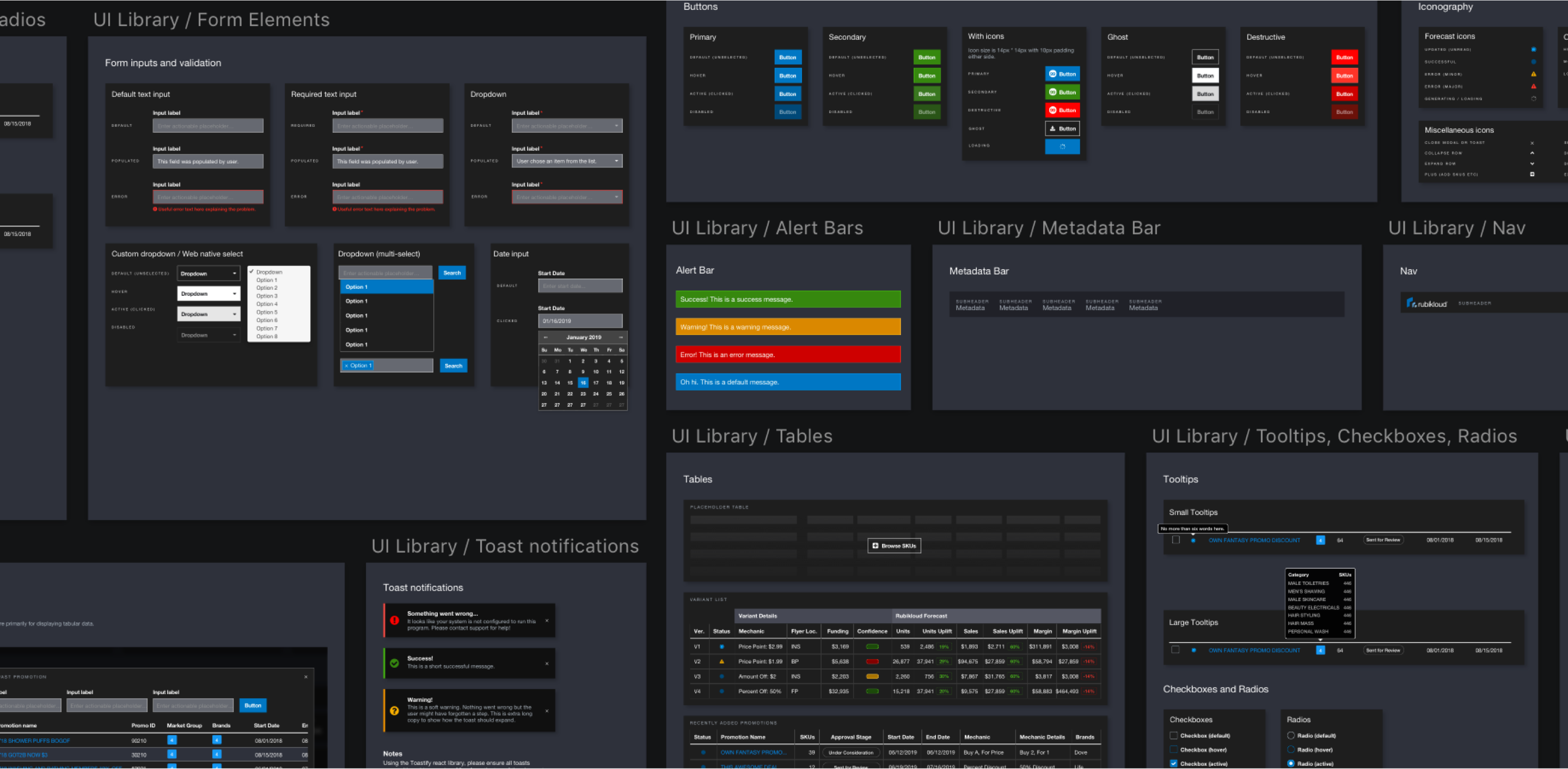
As a product designer at Rubikloud, I designed UI components, user flows, mock-ups and prototypes for the Promotion Manager suite and I built the majority of the symbol components for our UI library as we transitioned from a WordPress-based design flow over to Sketch.
I worked closely with a team of developers and product managers to launch a series of improvements to the promotion creation flow of the Promotion Manager suite. One of the biggest improvements was introducing more modular page layouts that could allow for device scalability in the future.
Design
- Wireframes
- Mockups
- Prototypes
- UX/UI
Dashboard concepts
While working through some mockups for the Promotion Manager suite, it became clear that there was some redundancy and opportunities for improvement. During one of our design team offsites, we decided one of the projects to focus on in the upcoming quarter were concepts for a dashboard to improve wayfinding for the user.
The Promotion Manager dashboard would be the first screen that a Category Manager would see when they log in, and each component would provide them with useful jumping-off points so they could drill down into the data that is most important to them at that moment.
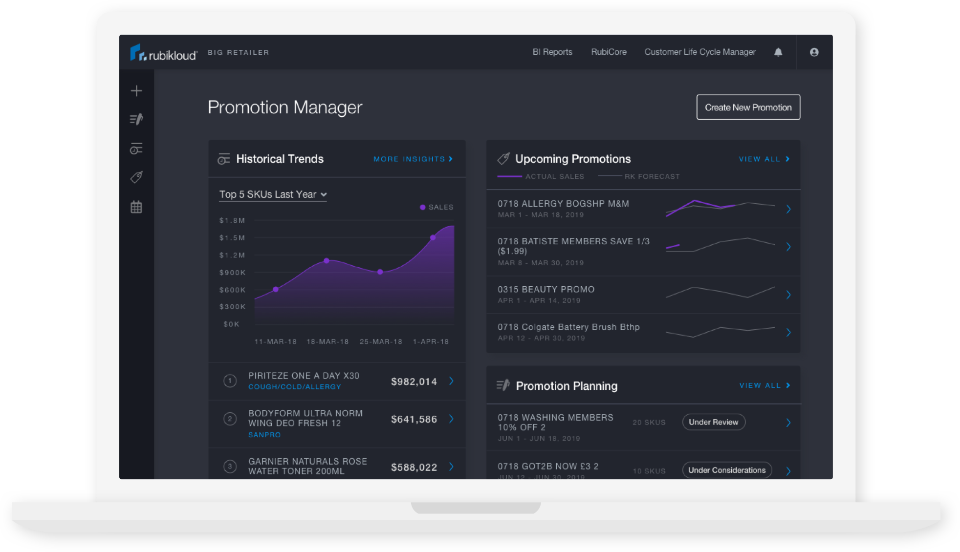
The above is a version of the dashboard exploring a new direction with the UI treatment. While keeping with the dark theme, I opted to lighten it up just a bit and introduce rounded corners, iconography and more modular components.
Challenges and next steps
There were a handful of challenges when considering the design of the Rubikloud platform, such as table interaction and scalability across international languages. Although we did iterate and make improvements over time, some of those challenges are still prevalent within the product.
Rubikloud users are familiar with sorting through large datasets and lean on functionality that you would find in spreadsheet software like excel. As such, we tried our best to replicate that functionality - such as filtering and sorting on columns. In the future, it would be ideal to allow the user to customize what columns they want to see and allow them to resize the columns and rows much like Microsoft Excel.